Sunday, December 30, 2018

"I Love Paris" Junk Journal Kit

A couple weeks ago I challenged myself to create an entire digital journal kit. I finished it in about a week or so and have asked a few journal makers to test it for me. In the meantime, I also made a journal that I've listed on Etsy. This post features the two kits. I'll be creating a new post featuring the completed junk journal itself.

First a peek at the journal pages and ephemera. Obviously in the purchased download, there are no watermarks.

This picture represents the background page journaling kit. There are 20 background pages -- half are sage green and half are a pinkish peach. The pages print out at 10 X 7 inches, resulting in a page that is 5 X 7 when folded. Two of the top row images are a full 8-1/2 X 11 inches so they are easily printed on the back of ephemera or background pages with no worry that they won't cover the entire page.

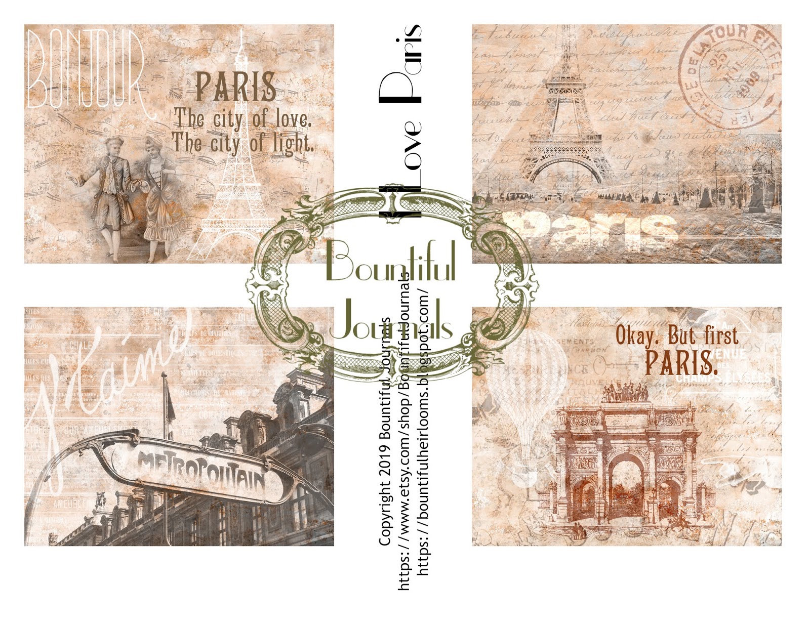
The following pictures show the ephemera that is in the I Love Paris Ephemera Kit.

I especially love vintage-style postcards, I did two each in peach and sage.

I decided to do some postcards that would contrast well with the peach and sage color scheme, just to create some variety. The upper left Ferris wheel postcard started out as a true vintage postcard. But I added the script text, the "grunginess", and the postcard label. For the bottom left postcard, I used a portion of a vintage photograph that showed the construction of the Eiffel Tower. I created the two postcards on the right from scratch, combining postcard text, some vintage script, and a variety of images that seemed kind of vintage France to me.


You may have seen these tags that I made several weeks ago. I updated them for this journaling kit and used the sage green and peach color scheme.

And now for some envelopes from the kit.


These are sized to hold a gift card. I like to fold them (into thirds) and just put them into the journal like an envelope.

This is a vertically oriented envelope, much like an oversized coin envelope. 

The Eiffel Tower image is a small coin envelope. The chalet image on the left folds up to be a pocket that can be glued into a journal, or left to use however you'd like.

These are library-style pockets. If you print something on the back of the paper, then when the pocket is folded that will show above the pocket. In the picture below you can see a little corner peeking through where I've printed a matching background.

Two mirror-image corner pockets.
Lastly, we have eight journaling cards in sage and peach. The same card images are featured in each color, but I've added sayings about France to two of them in each colorway.

I hope you like these kits. I was really pleased with how they turned out. After all, who doesn't love Paris?? I've been there six times since I was 19, and it never gets old -- not the food, not the shopping, not the ambiance, not anything!

Enjoy.


Friday, December 21, 2018

Shabby Chic Junk Journal

This may just be my favorite junk journal that I've ever made. I made it with a particular friend in mind who recently finished her doctoral program -- and I'm giving it to her today. So, I had to take lots of photos -- and even put them into a video. So, to see all of the photos, you'll need to watch the video. But some of my favorite spreads are featured below.

Click to watch the video.

I only purchased one digital kit for this journal -- called Flower Show from Screech Owl Studios. Everything else came from my stash, from a shabby chic swap I participated in, and I downloaded free images from Pixabay.

Here are a couple pics of the front cover. I wrapped the cover with fabric from my HUGE fabric stash. And the two main printables on the cover were from the Flower Show kit. The journal closure is beautiful overdyed sari silk ribbon. But my favorite part of the cover is the metal "cherish" embellishment. I received it as part of a swap and had actually forgotten about it. I was going through some piles of JJ stuff, and discovered it. It was the perfect addition to place on top of the crocheted lace trim.

One of my favorite embellishments for junk journals is miniature ephemera -- the mini tags and mini postcards. It's rare if one of my JJs doesn't include them. I've also shrunk down images of sheet music, letters with vintage script, and other collage pieces.

More fabric on the inside of the covers. The stuffed pocket on the inside of the front cover, above left, also came from the shabby chic swap. The colors paired so nicely with the rose image overlaid on wood that I printed on card stock as a cover for the first signature. This image was from Pixabay.

The page on the left is from the digital kit, Flower Show, from Screech Owl Studios. And on the right, some beautifully avocado-dyed paper. I can't take credit for it -- bought on Etsy. It's a nice addition to the shabby chic feel. (Yes, avocado skins result in a pink paper when used for dying.)

And, just as I like mini postcards and tags, I like them combined with full-size postcards and tags.


The music and floral background paper on the right is from Tsunami Rose. I had purchased it previously and had this already printed. It was the perfect backdrop for die-cut butterflies and tag.

The paper on the left was also from Pixabay. I think I changed the color to better fit the journal.

While I was making this journal I discovered "waterfalls", made from layered flip-ups. This one has some nice affirmations and reminders printed on the layers.

Also about the time I was making this JJ, I bought the Tim Holtz die for cutting the multi-slot tuck spot. So, it's full of mini tags and mini postcards. And the vintage music paper fit in nicely.

You're probably starting to see a theme here: mini tags, mini postcards, and pages with flowers overlaid on a wood background. This one is also from Pixabay. I made the tag on the right. It's a standard manila tag -- but by die cutting the bottom, collaging some images, and adding a sari silk ribbon, it totally fits with the shabby chic theme.


The glassine envelope and vintage roses printable were part of the shabby chic swap.

This is the center of the second signature. I changed the coloring of this spread to tone it down for the journal. NOTE: I did this in MS Word as I made this journal a month or so before I bought Photoshop Elements. But it worked! And the die-cut tuck spot folds over to the next page as you can see below.


While I was making this journal, I watched a video tutorial for making a combo belly band/book mark. Two long pieces of card stock are glued at the top and bottom so it slips over a page. I added an eyelet to the bottom and attached a charm with a bulb pin. (Too bad I didn't capture it in the photo.)

And inside the back cover is this faux policy envelope. It opens like a book as you can see below.


Well, I am pretty sure my friend will like this journal. I wouldn't ever be able to recreate it because there were so many unique items from swaps that I added to it. But I know I'll be doing shabby chic JJs again in the future.


Thursday, December 13, 2018

Free Printables: Homage to the Pantone Color for 2019

Pantone is a company that is best known for its PMS (Pantone Matching System) color matching guides to make it easier for printers, designers, and others to select and match specific colors. Each year they identify the trendy color for the next year. For 2019 the color they identified is Living Coral, described as a "vibrant orangey pink". I decided to create an eclectic mix of tags using Living Coral as the inspiration.

I had wanted to use this cute image of the girls for a while. Their dresses weren't the right color, but I recently did a Graphics Fairy tutorial that showed how to use a layer mask to easily "paint" over areas in the design with the preferred color. And the quote was the perfect addition.

Of course, I had to use some European ephemera to make a tag. So much ephemera is French, so it was nice to use something in German instead.

But I couldn't leave out the French. This tag combines a portion of a map of France with a French Chateau. Interestingly, the Benjamin Moore paint company has named "Metropolitan Gray" as their color of the year. And it works so nicely with Living Coral. 

This is a collaged image using five layers -- a gradient background I created using Living Coral and white; a grunge overlay; the music added using a Photoshop brush; and the woman in the garden and tree branches from The Graphics Fairy. 

This tag also is collaged using the similar approach -- a gradient background, text from a Photoshop brush, and two images from The Graphics Fairy. 

The color was starting to remind me of Valentine's Day. As a result, we have this tag featuring Cupid and a quote from Shakespeare.

This lady with her fan already was dressed in Living Coral. It was easy to add the text with a brush and a little flourish at the top of the tag.

Lastly, I wanted to use some ephemera featuring an old-fashioned big-wheel bicycle (also known as a "penny farthing"). I ended up making three tags because there were such great image options from Pixabay. My favorite one is the first one, but I also like the others. For the background, I started with a vintage floral design from The Graphics Fairy, removed the (somewhat garish) colors, and blended it with Living Coral.


So that is my homage to the Pantone color of the year -- Living Coral.

Enjoy!


Wednesday, December 12, 2018

Free Printables: A Celebration of Winter

Still loving the abstract background from The Graphics Fairy. All of the cottage images are from Pixabay.


Enjoy.


Tuesday, December 11, 2018

Free Printables: Castles In the Sky

This week's Graphics Fairy tutorial used their newest digital collection of abstract winter acrylic backgrounds. I did the tutorial and created the collage below. And then had fun with castle images and some great quotes about castles -- including quotes from Henry David Thoreau and Louisa May Alcott.


I loved the effect of blending the cottage into the background, so I found some castle pictures on Pixabay and did the same thing. Here are the results:


Enjoy.


LinkWithin

Related Posts with Thumbnails