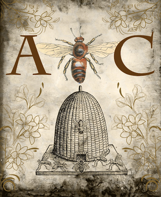
Here's the printable without the grunge layer.
A very "clean" and simple image, but I like it. But then again, I pretty much
like anything with bees and beehives!
And now with the grunge layer added. Each image below used a different blend mode for the grunge layer.
This used the "Soft Light" blending mode.
You can see a little texture along the edges. Since the grunge layer
was in different browns and rust colors, the resulting image has a little more warmth to it.
This one uses the "Darker Color" blend mode. The grunged edges
show up nicely, while the honeycomb background is still fairly light.
I like the contrast and how the edges work well with the color of the bee..
This used the "Multiply" blending mode. Similar to the previous one,
but the honeycomb background darkened a bit more as you can see.
This uses the "Luminosity" blending mode. The background became very neutral,
which makes the "A Bee C" the main focal point of the printable.
I'm surprised at how much I like these results, except that the
honeycomb background disappeared. But when I switched the order
of the grunge and honeycomb layers, this was the result (below).
Now the honeycomb background shows up and the overall background is once again neutral.
So that was a fun experiment. I usually play around with the blending modes while I'm designing printables (there are a couple dozen of them). Some work better than others for a particular layer.
Enjoy!


4 comments:
Hello, I came over from TLC. I like the lumosity and multiply (The darker ones) the best.Thanks for sharing. Mary
Very cool! I can spend hours manipulating images. It's so fun!
Beautiful and thank you!
Gorgeous. I love all the bee printables & the different effects on the same image. Beautiful. Thank you.
Post a Comment